
Canada Census Data
This blog post shares a project I worked on in MAT 4376 at University of Ottawa
- Part One: Data Quality Assessment
- Part Two: Data Dictionary and Source of the Data
- Part Three: Visualizations
- References
Part One: Data Quality Assessment
The first step to understanding a new and unknown dataset is to bring it into the workspace and analyze key aspects. This preliminary examination allows us to gain better insight of what the data is like.
# Reading the file
mydata =  read.csv("HR_2016_Census_simple.csv", header=TRUE, sep=",")
# Investigating the data
dim(mydata
## [1] 127 105
As we can see the HR 2016 Census data set contains over 105 variables and 127 observations.
Checking for null values
# Checking for empty cells
table(complete.cases(mydata))
##
## TRUE
##  127
This tells us that there is an “element” in each cell of the data set, but we need to be careful. It does not imply there are no missing values in our data set.
# Checking for special character (i.e. NA values)
# (Jong, n.d.)
is.special <- function(x){
  if (is.numeric(x)) !is.finite(x) else is.na(x)
  }

sapply(mydata, is.special)
# the output is too long to print
The above function checks for Not Available “na” values in the dataset.
By visual inspection of the dataset, we can see several fields do indeed contain invalid entries. For example, the LW_INC_ECON_FAM_RATE field in the data contains several “Div/0!”. This occurs when the divisor is 0, which is invalid.
Furthermore, there are more than just values that are considered “Not Available”. Additionally, several fields contain 0 as most of the entries, such as the POP_LRG_POP_CNTR field.
Outlier Detection
If we make a simple plot to visualize the values:
# Plotting the variable
plot(mydata$POP_PRIV_HHLDS_LW_INC,ylab  = "POP_PRIV_HHLDS_LW_INC")
[PLOT_1]
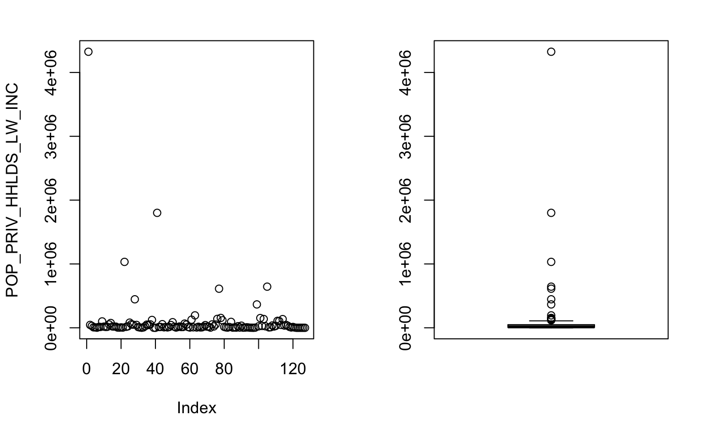
Plotting this column gives us a better understanding of what is going on in particular with POP_PRIV_HHLDS_LW_INC. There is an extreme outlier in this data set which is skewing the summary statistics, in particular the mean and the standard deviation.
NOTE: POP_PRIV_HHLDS_LW_INC stands for Persons in private households in low income before tax in 2015.
Tukey’s Box-and-Whisker Method
# Plotting the outliers
boxplot.stats(mydata$POP_PRIV_HHLDS_LW_INC)$out
[1] 4324825 1032590  446250  122815 1800930  126870  194670  139655  612365  154500  117855  366000  152745  137690  644550
[16]  135915
In the above function, we are using a function provided in base R. This function uses the Tukey’s box-and-whisker method for outlier detection. In this method, an observation is an outlier when it is larger than the so-called ``whiskers’’ of the set of observations. The upper whisker is computed by adding 1.5 times the interquartile range to the third quartile and rounding to the nearest lower observation. The lower whisker is computed likewise. (An introduction to data cleaning with R,2013)
However, if we look at the description of the field: Persons in private households in low income before tax in 2015(POP_PRIV_HHLDS_LW_INC), the first data point is entire Canada. While other observations are the provinces.
The data set at first glance seems to contain outliers; however, at a closer look, we noticed that the outliers are just the observations of bigger regions( such as provinces and Canada as a whole).
Red Flags in Data
There are a few red flags in this dataset. First off, we have 105 fields, with only 127 observations. Furthermore, some fields in this dataset such as LRG_POP_CNTR_RATE contian a majority of values which are zeros but also contain very large values. This leads to extremely skewed statistics. The data set at first glance seems to contain outliers; however, at a closer look, we noticed that the outliers are just the observations of bigger regions( such as provinces and Canada as a whole).
Additionally, there are “##div/0” values in some of the fields. In this data, we are observing different Geo Codes in Canada. Naturally, there is a lot of variation between them, especially if they are not the same size. Therefore, one solution might be to find values from similar geocodes and fill them in. However, this approach gets more complex. How do you really pick which geo code is the “best” approximation. The selection process becomes even more challenging when we realize that the geocodes differ in sizes.
Part Two: Data Dictionary and Source of the Data
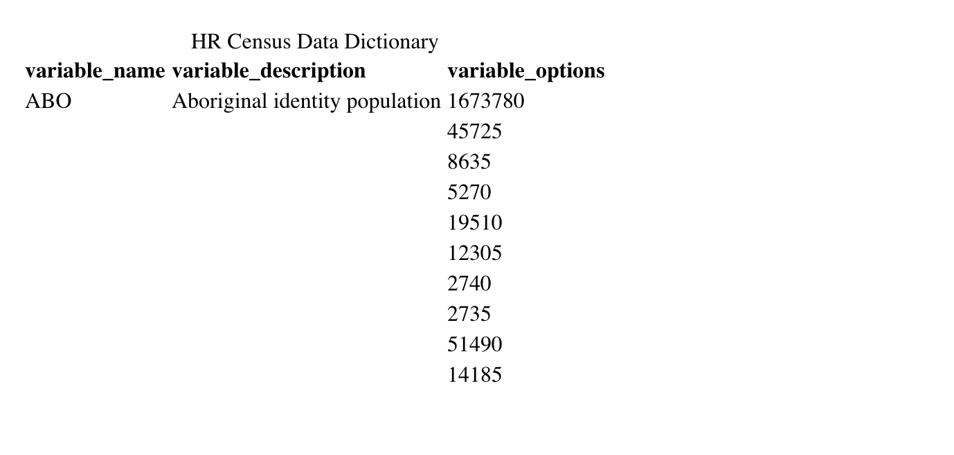
In the first task we are ask to create a “data dictionary” to explain the different fields and variables. It also asks us find a source for the data set online.
Looking at the dataset, we can immediately tell that finding a source for this data is a priority, since all of the fields in the dataset are abbreviated, which creates ambiguity as to what they are actually refering to.
After researching online we were able to track down two datasets which contain seem to contain the fields. “Census indicator profile, based on the 2016 Census short-form questionnaire, Canada, provinces and territories, and health regions (2017 boundaries)” and “Census indicator profile, based on the 2016 Census long-form questionnaire, Canada, provinces and territories, and health regions (2017 boundaries)” from Statistics Canada.
Now we proceed to make the data dictionary….
…After a few hours of work we made a CSV file which contains the descrptions of (most) fields, with respect to the order of the data set we were given for the assgnment.
# Creating the data dictionary using linker
# Creating the data dictionary using linker
field_names = read.csv("description.csv", header=TRUE, sep=",")
var_desc = (field_names$variable_description)
var_type=replicate(105,1)
linker = build_linker(mydata,
                      variable_description = var_desc,
                      variable_type = var_type)
dim(linker)
[1] 105 3
To double check the dictionary we have built we can check the description for the variables which should be a character.
# Checking the type of the descriptions
typeof(var_desc)
## [1] "integer"
As can be seen above, the type in integer which is incorrect which means it must be corrected. From there, the dictionary can be created again.
# Fixing the description types and creating a corrected dictionary
var_desc2 = as.character(var_desc) # (Cookbook-r, n.d.)
typeof(var_desc2)
## [1] "character"
# Finalizing and printing the dictionary for viewing
dict = build_dict(my.data= mydata,
                  linker=linker,
                  option_description = NULL,
                   prompt_varopts = FALSE)

kable(head(dict,10),
      format = "html",
      caption = "HR Census Data Dictionary")
As can be seen above, the data dictionary has been created. It contains all variables, their descriptions, and the possible values they may take.
Part Three: Visualizations
These observations range from looking at small subsections of the population, to provinces, and one the observation is the also the entire Canada. Therefore, we must use ratios to construct graphics that compare more than 2 variables.
Why should we normalize the variables?
In Part One we learned that observations in the dataset vary a lot. One of the observations in the data is Canada as a whole, while the other observations range from provinces of Canada to smaller regions, which are a subset of Canada. This means many of the observations heavily skew the data and are redundant.
One solution is to get rid of them. At first glance, this might seem like a viable solution, since the observations are highly correlated with each other (e.g average income rate of Canada should be highly correlated with the average income rate of the individual provinces).
However, we don’t know if the smaller sub-regions in the dataset are disjoint sets which make up the provinces. Therefore, by getting rid of the “outlier”, we can potentially be getting rid of useful information. Hence, by normalizing the values (dividing by total population of the region), we can still include the provinces in our data, without having them skew the data.
The first graph shows what happens when we do not normalize our data.
a = ggplot(data, aes(x= HSG, y = UE))

  a+geom_smooth(method="loess") +
labs(
       y="Long-term unemployed",
       x="High school graduates aged 25 to 29",
       title="Scatterplot Comparing High school graduate vs.Long-term unemployed ",
       caption = "Source: HR_2016_Census_simple")+
    geom_rug() # (RStudio, 2015)
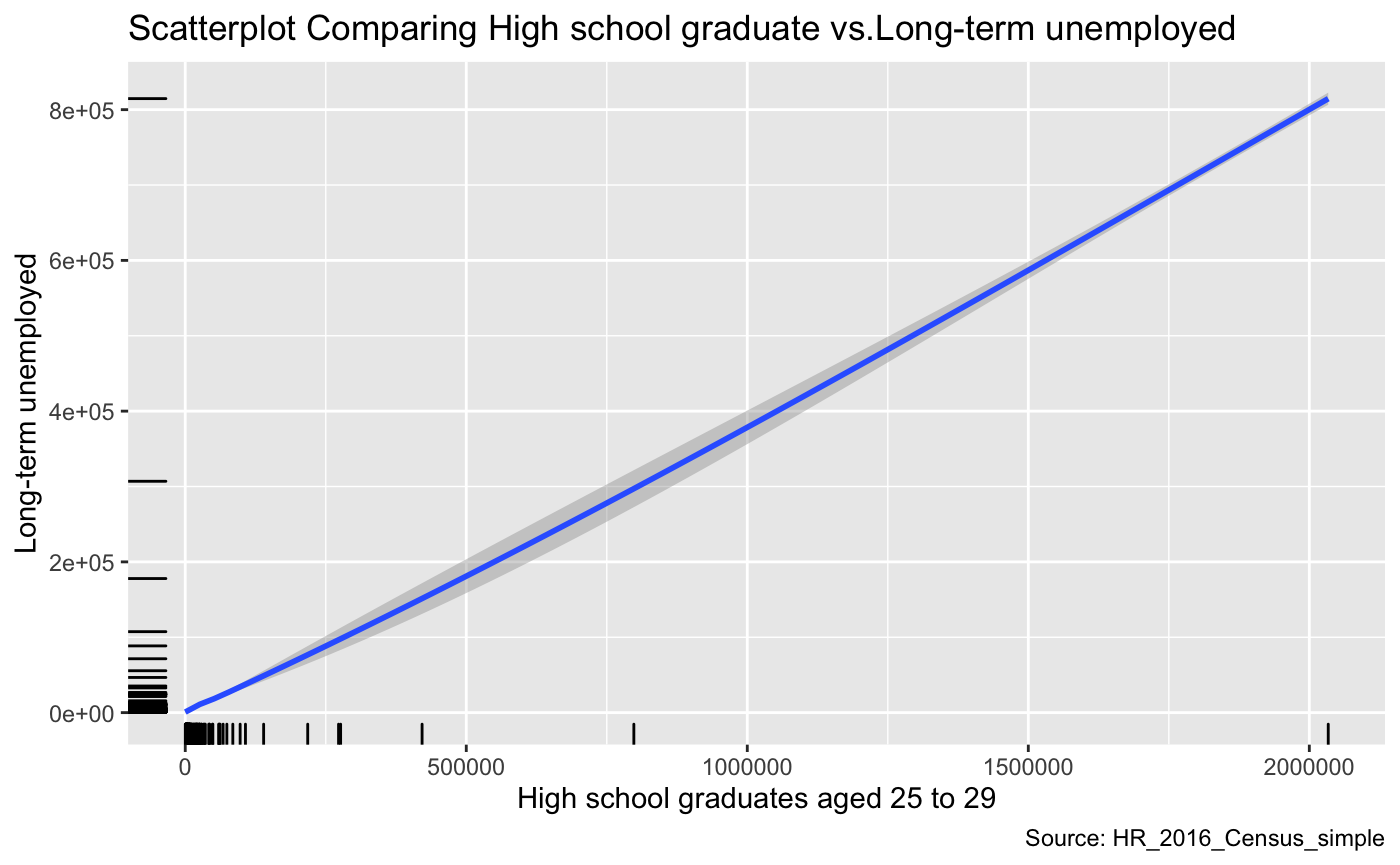
As we can notice from the graph above, there seems to be a linear relationship between the number of high graduates and Long-term unemployment. This relationship appears to be a positive relationship that seems counter-intuitive. One would expect the data to show that education and the number of unemployed people to be negatively correlated. A potential explanation is that the observations come from regions that are highly varied in size. Naturally, regions with larger populations will have more people unemployed and more people that will graduate high school. Thus this might be one reason why we see this trend in the graph. However, it is essential to note that after further visual investigation, we can see that the variables in this dataset that are not normalized cannot be visualized accurately.
The next graph shows what happens when we do normalize our data (use proportion or ratios instead of raw values).
a = ggplot(data, aes(x= HSG_RATE, y = UE_RATE))

a+geom_smooth(method="loess") +
labs(
       y="Long-term unemployed Rate",
       x="High school graduates aged 25 to 29, Proportion",
       title="Comparing High school graduate vs.Long-term unemployed Rates ",
       caption = "Source: HR_2016_Census_simple")+
    geom_rug() # (RStudio, 2015)
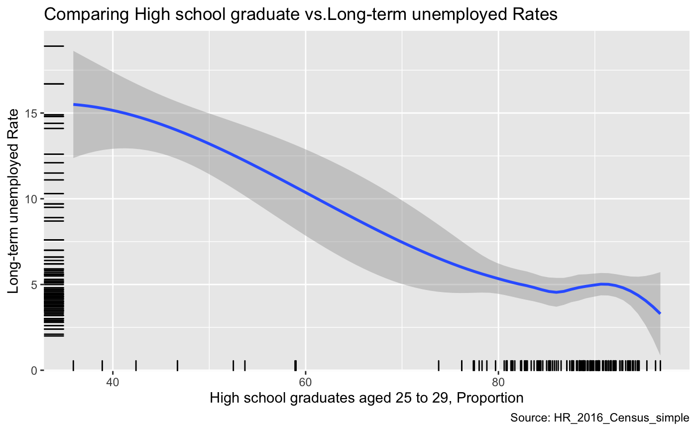
This graph compares the Long-term unemployed Rate and Proportion of High school graduates aged 25 to 29. From this graph, we can observe that the high school graduation rate is negatively correlated with long term unemployment. This is completely opposite from the previous graph. Once we normalize the data with respect to size, we can see that the high school graduation rate and Long-term unemployment have a negative relationship. It is vital to note that we are not confusing correlation with causation.
This example demonstrates the importance of using ratios/proportions instead of plotting raw values in this dataset. For the rest of the visualizations we will only use normalized variables.
Visualizations
x <- list(
  title = "Lone-parent families, proportion of census families"
  )

y <- list(
  title = "High school graduates aged 25 to 29, Proportion"
)
p = plot_ly(
  data, x = ~LONE_RATE, y = ~HSG_RATE,
  # Hover text:
  color = ~LONE_RATE, size = ~LONE_RATE) %>%
  layout(xaxis = x, yaxis = y) # (Plotly, 2019), (R Stat co., 2019)
p
As we can see from the above visualization, there seems to be a trend between the proportion of lone-parent families and High school graduates aged 25 to 29. There is a negative correlation between the two variables within this dataset. However, this does not imply causation!!
p = plot_ly(data, x = ~HSG_RATE, y = ~LONE_RATE, z = ~UE_RATE, color = ~HSG_RATE,
        colors = c('#BF382A', '#0C4B8E')) %>%
        add_markers() %>%
        layout(scene = list(xaxis = list(title = 'High school graduates aged 25 to 29'),
                     yaxis = list(title = 'proportion Lone-parent families'),
                     zaxis = list(title = 'Long-term unemployed Rate')))
p
This graph displays the relationship between the three variables we have explored in the dataset this far. The x-axis is the High school graduates rate, the y-axis is the proportion of Lone-parent families, and the z-axis the long-term unemployment rate. The trend we can notice from this graphic is that low rates of highscool graduation and high proportion of Lone-parent families have high unemploymentent rate. However, we are not making the mistake of confusing the correlation with causation!! There could be other factors that affect the distribution of the data.
p = plot_ly(data, x = ~HSG_RATE, y = ~AVE_PERS_INC,
        marker = list(size = 10,
                       color = 'rgba(255, 182, 193, .9)',
                       line = list(color = 'rgba(152, 0, 0, .8)',
                                   width = 2))) %>%
  layout(title = "High school graduates aged 25 to 29 vs. Average total income in 2015 ",
         xaxis = list(title = "High school graduates aged 25 to 29"),
         yaxis = list (title = "Average total income in 2015"))
p
In this graph, High school graduates aged 25 to 29 was chosen as the independent variable and we want to examine if there is some relationship between the Average total income in 2015 that is present in this dataset. We can see that the variance of the average income increases a lot when propotion of highschool gradudates is above 80%. This makes logical sense because some proportion of highschool graduates will go on to university, and others may not, and this may result in the variation of average total income. However, there may be even more hidden variables to consider, and we should not draw any strong conclusions based on this simple plot.
a = ggplot(data, aes(x= PSG_RATE, y = UE_RATE))

a+geom_smooth(method="loess") +
labs(
       y="Long-term unemployed Rate (%)",
       x="Proportion of Post-secondary graduates aged 25 to 54 (%)",
       title="Comparing Post-secondary graduates vs.Long-term Unemployement Rate",
       caption = "Source: HR_2016_Census_simple")+
    geom_rug() # (RStudio, 2015)
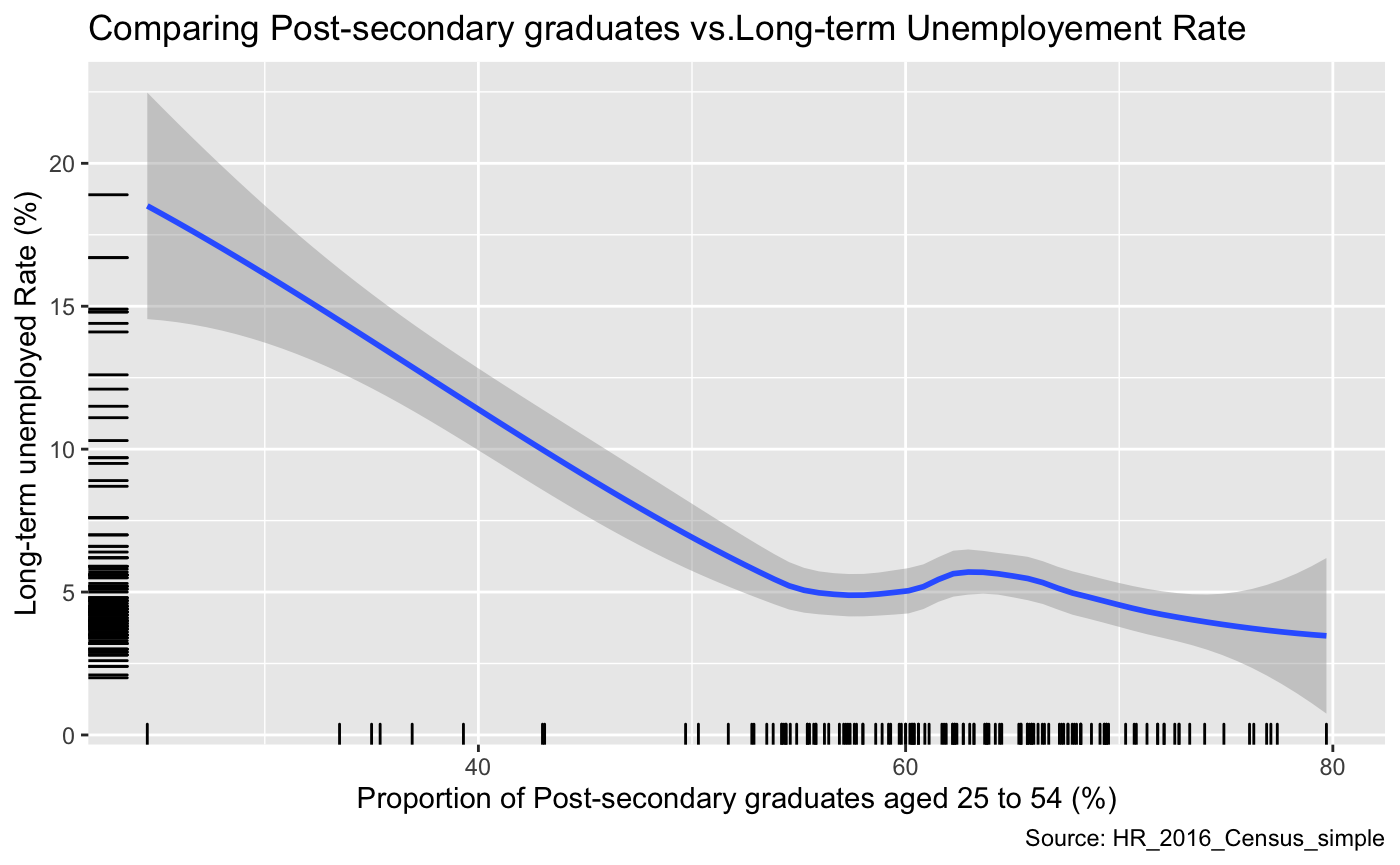
This graph compares the post-secondary graduates’ rate versus the long-term unemployment rate. Overall, we can see that these two variables are negatively correlated. Although it does contain region at (x=60%) where, as the proportion of post-secondary graduates increase, the un-employment rate does as well. However, we need to consider the fact that this data is not perfect; as the observations in this data vary widely, and secondly there are many additional variables that could be influencing unemployment rate.
p =plot_ly(data, x = ~ PSG_RATE,
        y = ~UE_RATE,
        z = ~AVE_PERS_INC,
        color = ~HSG_RATE,
        colors = c('#BF382A', '#0C4B8E')) %>%
        add_markers() %>%
        layout(scene = list(xaxis = list(title = 'Proportion of Post-secondary graduates'),
                     yaxis = list(title = 'Long-term Unemployement Rate'),
                     zaxis = list(title = 'Average total income in 2015'))) # (Plotly, 2019)

api_create(p, filename = "r-docs-Long-term Unemployement")
This plot displays the Proportion of Post-secondary graduates on the x-axis, Long-term Unemployement Rate on the y-axis and the Average total income in 2015. As we can see observations with the lowest long-term unemployment and the highest proportion of post-secondary graduates have the highest average income.
References
Converting between Data Frames and Contingency Tables, Cookbook-r, n.d. www.cookbook-r.com/Manipulating_data/Converting_between_data_frames_and_contingency_tables/. Accessed Nov. 6, 2019.
Dave. “GGPlot Colors Best Tricks You Will Love.” Datanovia, 18 Nov. 2018, www.datanovia.com/en/blog/ggplot-colors-best-tricks-you-will-love/. Accessed Nov 5. 2019.
Rodriguez, Dania M. DataMeta: Making and Appending a Data Dictionary to an R Dataset, 11 Aug. 2017, cran.r-project.org/web/packages/dataMeta/vignettes/dataMeta_Vignette.html. Accessed Nov 5. 2019.
“A Short Tutorial for Decent Heat Maps in R.” Dr. Sebastian Raschka, 8 Dec. 2013, sebastianraschka.com/Articles/heatmaps_in_r.html. Accessed Nov 5. 2019.
Statistics Canada: Canada’s National Statistical Agency / Statistique Canada : Organisme Statistique National Du Canada, www150.statcan.gc.ca/t1/tbl1/en/tv.action?pid=1710012201. Accessed Nov 5. 2019.
Statistics Canada: Canada’s National Statistical Agency / Statistique Canada : Organisme Statistique National Du Canada, www150.statcan.gc.ca/t1/tbl1/en/tv.action?pid=1710012301. Accessed Nov 3. 2019.
Edwin de Jonge. “An Introduction to Data Cleaning with R.” Https://Cran.r-Project.org/, n.d., cran.r-project.org/doc/contrib/de_Jonge+van_der_Loo-Introduction_to_data_cleaning_with_R.pdf. Accessed Nov 2. 2019.
“A Quick Introduction to Ggplot().” Noamross.net, www.noamross.net/archives/2012-10-05-ggplot-introduction/. Accessed Nov 5. 2019.
“3D Scatter Plots.” Plot.Ly, 2019, plot.ly/r/3d-scatter-plots/. Accessed 6 Nov. 2019.
“Plotly Open Source Graphing Libraries.” Plot.Ly, 2019, plot.ly/graphing-libraries/. Accessed 6 Nov. 2019.
“Scatter and Line Plots.” Plot.Ly, 2019, plot.ly/r/line-and-scatter/. Accessed 6 Nov. 2019.
RStudio. “Graphical Primitives Data Visualization with Ggplot2 Geoms -Use a Geom to Represent Data Points, Use the Geom’s Aesthetic Properties to Represent Variables. Each Function Returns a Layer. One Variable Geoms”. RStudio, March, 2015. https://rstudio.com/wp-content/uploads/2015/03/ggplot2-cheatsheet.pdf. Accessed November 6th, 2019.
R Stat co. “Top 50 Ggplot2 Visualizations - The Master List (With Full R Code).” R-Statistics.Co, 2019, r-statistics.co/Top50-Ggplot2-Visualizations-MasterList-R-Code.html. Accessed November 6h, 2019.