
Car Collisions In Ottawa
This is another Project I worked on in MAT 4376 at uOttawa.
- Motivation for Project
- Part One: Preliminary Data Inspection?
- Part Two: Visualizing and Understanding the Data
- Appendix: Additional Plots
- References
Motivation for Project
In this second blog post, we will examine a Car Collisions Dataset from the City of Ottawa. This data comes from the City of Ottawa repository of vehicle collisions within the city. Visual inspection of the data reveals that it tracks locations and times of collisions in Ottawa during the 2016 year and the type of impact that occurred. The key question of interest for us is: which conditions lead to more accidents in Ottawa? The data also lists locations for each collision. It would be useful to check which areas in Ottawa have more accidents than others.
Part One: Preliminary Data Inspection?
From a primary visual inspection of the data, it can be seen that there are some issues present. First of all, the date column contains many entries with “#######” instead of an actual date in the original file. This also raises questions on the data itself. Are all of the entries valid?
The X and Y Coordinates
In the dataset, we are given X and Y coordinates along with the location. We can try plotting these on an interactive map to see what happens.
fig <- data
fig <- fig %>%
  plot_ly(
    lat = ~X,
    lon = ~Y,
    marker = list(color = "fuchsia"),
    type = 'scattermapbox',
    hovertext = data[,"Location"])
fig <- fig %>%
  layout(
    mapbox = list(
      style = 'open-street-map',
      zoom =2.5,
      center = list(lon = -88, lat = 34)))

fig
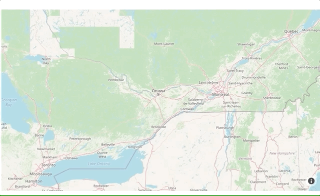
After doing a little googling, I realized that these are not latitude and longitude coordinates, so we cannot see anything on the map. The coordinates seem to be a bit of a mystery to me. It would be useful to find a tool or formula (?), which would allow us to convert them into latitude and longitude. I must admit my knowledge when it comes to Geocoding is pretty limited.
Fixing the Date Column
A column of vital interest, the “Date” column, has the issue that the dates used come in two different formats. Unfortunately, this means that it cannot be easily read in R until it is appropriately formatted. It can be seen below that R reads in the data incorrectly.
# Examining the Date column as brought in by R
head(collisionsData$Date)
[1] 2008-04-16 3/30/16    2009-02-16 2003-12-16 8/23/16    2007-06-16
366 Levels: 1/13/16 1/14/16 1/15/16 1/16/16 1/17/16 1/18/16 1/19/16 1/20/16 1/21/16 1/22/16 1/23/16 1/24/16 ... 9/30/16
Therefore, we will reformat the Time column
# Formatting and ordering the time format into a new column
collisionsData$hm <- as.POSIXct(collisionsData$Time,
                                format = "%H:%M")

collisionsData$hm <- as_datetime(collisionsData$hm)
head(collisionsData$hm)
[1] "2020-09-12 21:03:00 UTC" "2020-09-12 19:44:00 UTC"
[3] "2020-09-12 20:02:00 UTC" "2020-09-12 21:30:00 UTC"
[5] "2020-09-12 19:52:00 UTC" "2020-09-12 20:19:00 UTC"
Now we can move on to visualizing the data
Part Two: Visualizing and Understanding the Data
Before we move forward with analysis, one crucial fact to note is we can not draw any causal conclusions based on this analysis. There could be other factors that affect the data.
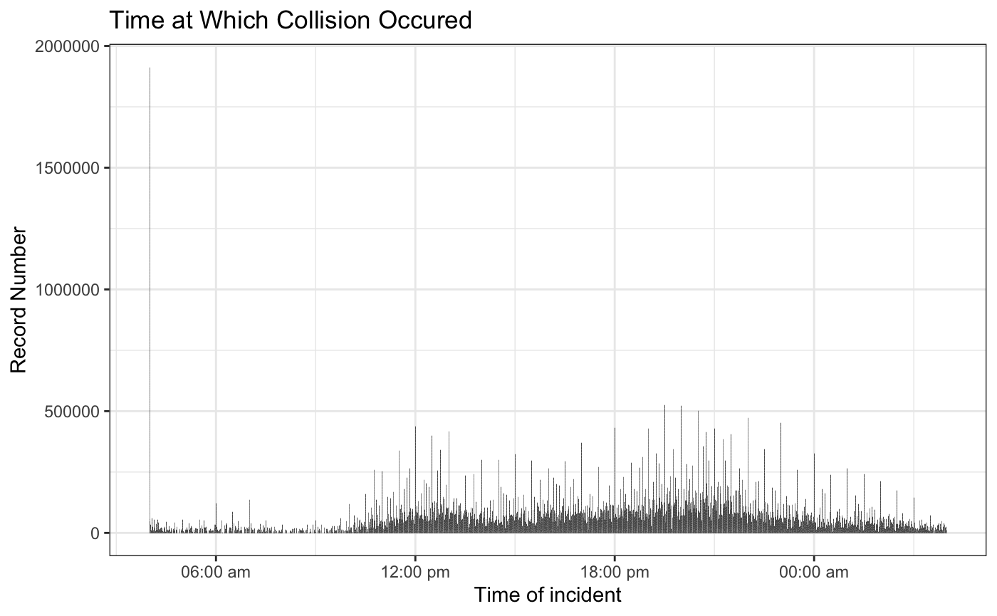
What time do most accidents occur at?
# Scatter plot for time of collisions
p =ggplot(data = collisionsData, mapping = aes(x=hm, y =Record)) +
  geom_bar(stat='identity') +
  xlab("Time of incident") +
  ylab("Record Number")+
  ggtitle("Time at Which Collision Occured")+
  scale_x_datetime(date_labels = "%H:%M %p")+
  theme_bw()
p
ggplot(data = collisionsData, mapping = aes(x = hm)) +
  geom_freqpoly() + xlab("Time") + ylab("Record") +
  ggtitle("Time of Colisions") +
  scale_x_datetime(date_labels = "%H:%M %p") +
  theme_linedraw()
From the above graphs, it can be seen that time is a factor in terms of collision frequency. Note that early morning hours between midnight and 6:00 am have the least amount of collisions. This could be due to the fact that most people are sleeping and therefore, there are fewer vehicles and people on the road. Furthermore, it can be seen that the most amount of collisions occurs in the late afternoon between 3:00 pm and 6:00 pm. This could be due to high traffic and people returning from work; however, more analysis is required before any conclusions can be made. We cannot make any causal conclusions form this analysis.
At what locations do most accidents in Ottawa occur at?
coll_chart_data= data %>%
  group_by(Collision_Location)  %>%
  summarise(count = n())
  plot_ly(coll_chart_data,labels = ~Collision_Location, values = ~count) %>%
  add_pie(hole = 0.6) %>%
    layout(title = "Collision Location",
           xaxis = list(showgrid = FALSE, zeroline = FALSE, showticklabels = FALSE),
         yaxis = list(showgrid = FALSE, zeroline = FALSE, showticklabels = FALSE))
As we can see most of the accidents according to our data set occur at non-intersection locations. There
How dangerous are the collisions?
‘Dangerous’ can be a relative term, but the City of Ottawa categorizes collisions into three categories: Fatal injuries, non-fatal injury, and property damage only (P.D. only).
## get rid of this plot (dougnout plot replaces it)
ggplot(data,aes(x = Collision_Classification)) +
  geom_bar(colour="purple", fill= "",
            alpha=0.5,
           linetype="dashed",
           size=0.5) +
  labs(x = "Collision Classification") +
  labs(y = "Number of Accidents")+
  labs(title = "Collision Classification and Number of Accidents" ) +
  theme_linedraw()
This plot displays the three categories of collision classification present in this dataset and their respective counts per category. As we can see, most of the collisions recorded in this dataset are P.D only (property damage).
In what weather conditions do most collisions happen in?
sum_enviro= data %>%
  group_by(Environment)  %>%
  summarise(count=n())
p <- plot_ly(sum_enviro, labels = ~Environment, values = ~count, type = 'pie') %>%
   layout(title = "Environment",
           xaxis = list(showgrid = FALSE, zeroline = FALSE, showticklabels = FALSE),
         yaxis = list(showgrid = FALSE, zeroline = FALSE, showticklabels = FALSE)) # (Plotly, 2019), (R Stat co., 2019)
p
The above pie chart displays the number of accidents which occurred in a particular environment. As we can see, in this dataset, most of the crashes seem to have occurred in a clear environment.
Under what road surface conditions do most collisions happen in?
p = ggplot(data,aes(x = Road_Surface)) +
  geom_bar(colour="green", fill= "blue",
            alpha=0.5,
           linetype="dashed",
           size=0.5)+
  labs(x = "Road Surface") +
  labs(y = "Number of Accidents")+
  labs(title = "Road Surface and Number of Accidents") + theme_linedraw() +
  theme(axis.text.x = element_text(angle = 45, hjust = 1))
p
The histogram above shows that most of the accidents that were recorded in this dataset occurred in dry conditions.
Appendix: Additional Plots
** Distribution of Impact Type, Traffic Controls, and Time of Day**
colors <- c('rgb(211,94,96)', 'rgb(128,133,133)', 'rgb(144,103,167)', 'rgb(171,104,87)', 'rgb(114,147,203)') # (Columbia U, n.d.)
sum_Traffic_Control= data %>%
  group_by(Traffic_Control)  %>%
  summarise(count=n())

sum_Impact_type= data %>%
  group_by(Impact_type)  %>%
  summarise(count=n())

sum_Light= data %>%
  group_by(Light)  %>%
  summarise(count=n())

p <- plot_ly() %>%

  add_pie(data = sum_Traffic_Control, labels = ~Traffic_Control, values = ~count,
          name = "Cut", domain = list(x = c(0, 0.4), y = c(0.4, 1))) %>%
  add_pie(data = sum_Impact_type, labels = ~Impact_type, values = ~count,
          name = "Color", domain = list(x = c(0.6, 1), y = c(0.4, 1))) %>%
  add_pie(data = sum_Light, labels = ~Light, values = ~count,
          name = "Clarity", domain = list(x = c(0.25, 0.75), y = c(0, 0.6))) %>%
  layout(title = "Traffic Controls, Impact type, and Light",showlegend = F,
         xaxis = list(showgrid = FALSE, zeroline = FALSE, showticklabels = FALSE),
         yaxis = list(showgrid = FALSE, zeroline = FALSE, showticklabels = FALSE)) # (R Stat co., 2019), (Plotly, 2019)
p
We can visualize three different variables from the data set; Traffic Controls, Impact type, and Light. We see that most of the accidents occurred when there were no traffic controls. Furthermore, the majority of the accidents occurred in daylight. Additionally, we can see that the majority of the impact types are rear-end hits.
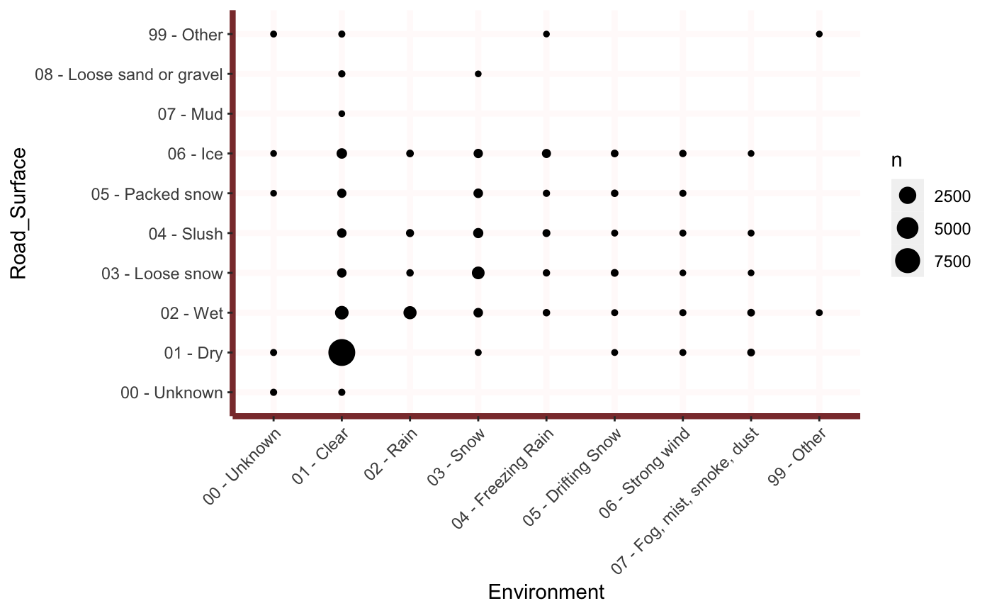
What Environment and Road Surface conditions lead to most accidents?
p=ggplot(data, aes(x=Environment,y= Road_Surface))
p+ geom_count()+  theme(axis.text.x = element_text(angle = 45, hjust = 1))+
theme(panel.background = element_rect(fill = 'white'),
          panel.grid.major = element_line(colour = "snow", size=1.5),
          panel.grid.minor = element_line(colour = "tomato",
                                          size=.25,
                                          linetype = "dashed"),
          panel.border = element_blank(),
          axis.line.x = element_line(colour = "indianred4",
                                     size=1.5,
                                     lineend = "butt"),
          axis.line.y = element_line(colour = "indianred4",
                                     size=1.5)) # (Columbia U, n.d.), (R Stat co., 2019)
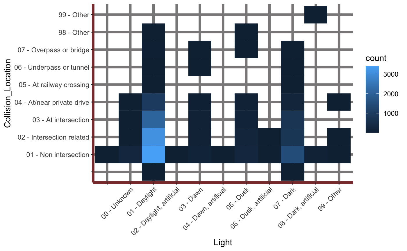
Is there a relationship between Time of Day and Collision location?
p=ggplot(data, aes(x=Light, y= Collision_Location ))
p+ geom_bin2d()+ theme(axis.text.x = element_text(angle = 45, hjust = 1))+
  theme(panel.background = element_rect(fill = 'white'),
          panel.grid.major = element_line(colour = "snow4", size=1.5),
          panel.grid.minor = element_line(colour = "tomato",
                                          size=.25,
                                          linetype = "dashed"),
          panel.border = element_blank(),
          axis.line.x = element_line(colour = "indianred4",
                                     size=1.5,
                                     lineend = "butt"),
          axis.line.y = element_line(colour = "indianred4",
                                     size=1.5)) # (Columbia U, n.d.), (Stagraph, 2018), (R Stat co., 2019)
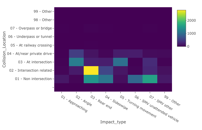
Are there any patterns in between Location of the Collision and the Type of Impact?
p= plot_ly(data, x = ~Impact_type, y = ~Collision_Location)
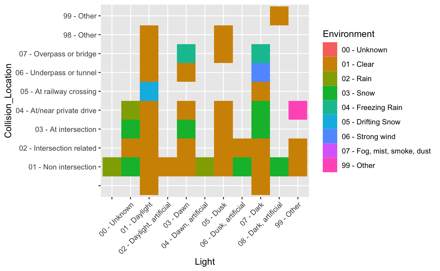
What is the relationship between Time of Day (Light), Collision Location, and Environment
q = ggplot(data, aes(x=Light, y= Collision_Location)) +
 geom_raster(aes(fill=Environment),
                hjust = 0.5,vjust = 0.5,interpolate = FALSE) +
  theme(axis.text.x = element_text(angle = 45, hjust = 1))

q
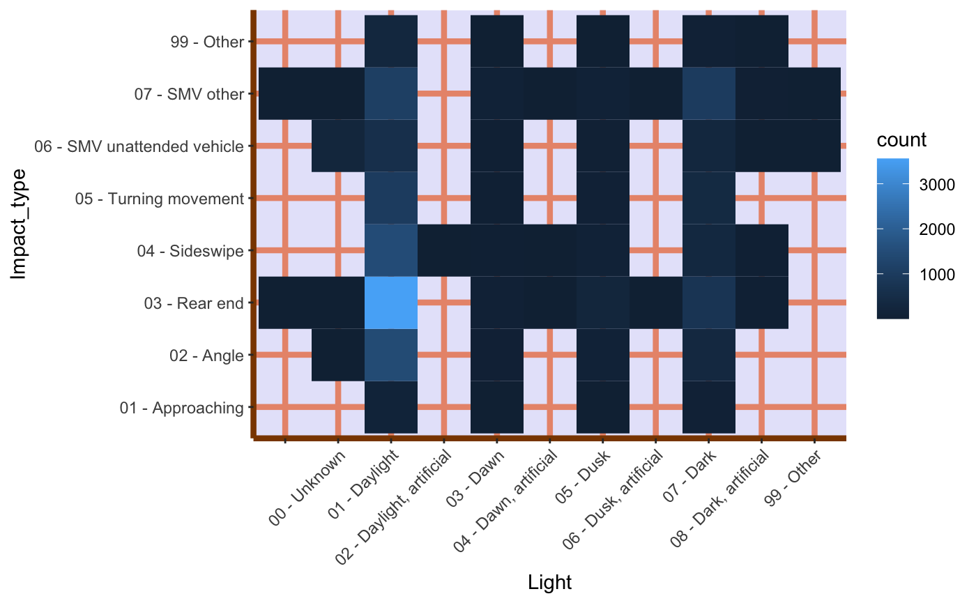
Impact Type and Time of the day
p=ggplot(data, aes(x=Light, y= Impact_type ))
p+ geom_bin2d()+ theme(axis.text.x = element_text(angle = 45, hjust = 1))+
  theme(panel.background = element_rect(fill = 'lavender'),
          panel.grid.major = element_line(colour = "darksalmon", size=1.5),
          panel.grid.minor = element_line(colour = "tomato",
                                          size=.25,
                                          linetype = "dashed"),
          panel.border = element_blank(),
          axis.line.x = element_line(colour = "darkorange4",
                                     size=1.5,
                                     lineend = "butt"),
          axis.line.y = element_line(colour = "darkorange4",
                                     size=1.5))
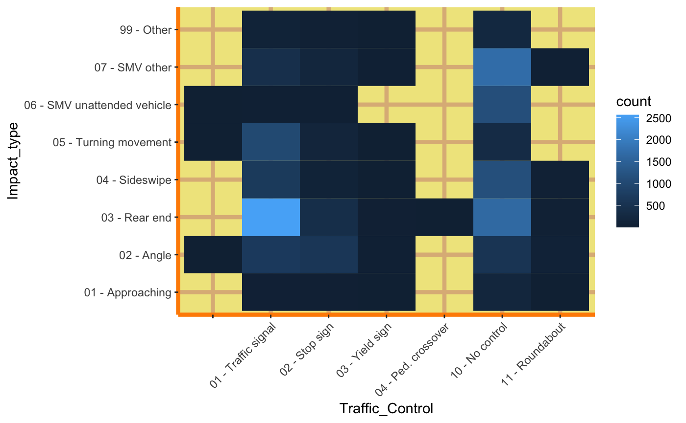
Impact Type and Traffic Control
p=ggplot(data, aes(x=Traffic_Control,y= Impact_type))
p+geom_bin2d() + theme(axis.text.x = element_text(angle = 45, hjust = 1))+
  theme(panel.background = element_rect(fill = 'khaki'),
          panel.grid.major = element_line(colour = "burlywood", size=1.5),
          panel.grid.minor = element_line(colour = "tomato",
                                          size=.25,
                                          linetype = "dashed"),
          panel.border = element_blank(),
          axis.line.x = element_line(colour = "darkorange",
                                     size=1.5,
                                     lineend = "butt"),
          axis.line.y = element_line(colour = "darkorange",
                                     size=1.5))
References
City of Ottawa. “Annual Safety Reports”. City of Ottawa, 2016. https://ottawa.ca/en/parking-roads-and-travel/road-safety/annual-safety-reports#2016-ottawa-road-safety-report. Accessed October 15th, 2019.
Rodriguez, Dania M. “dataMeta: Making and Appending a Data Dictionary to an R Dataset” cran.r.project.org, 11th August, 2017, https://cran.r-project.org/web/packages/dataMeta/vignettes/dataMeta_Vignette.html. Accessed October 15th, 2019.
Kabacoff, Robert I. “Descriptive Statistics”. Datacamp, 2017. https://www.statmethods.net/stats/descriptives.html. Accessed October 15th, 2019. https://stackoverflow.com/questions/15951216/too-many-factors-on-x-axis
Mbq. “Conditionally Remove Data Frame Rows with R”. StackExchange, November 4th, 2011. https://stackoverflow.com/questions/8005154/conditionally-remove-dataframe-rows-with-r. Accessed October 18th, 2019.
Ferapontov, Alexy. “Convert 12 Hour Character Time to 24 Hour”. Stackexchange, April 23rd, 2015.https://stackoverflow.com/questions/29833538/convert-12-hour-character-time-to-24-hour. Accessed October 18th, 2019.
Plant, Robert. “How to plot Time Interval only on x axis without date?” Stacexchange, March 23rd 2016. https://stackoverflow.com/questions/36172527/how-to-plot-time-interval-only-on-x-axis-without-date. Accessed October 20th, 2019.
Chang, Jonathon. “Rotating and Spacing Axis Labels in ggplot2”. Stackexchange, August 25th, 2009. https://stackoverflow.com/questions/1330989/rotating-and-spacing-axis-labels-in-ggplot2. Accessed October 26th, 2019.
“A Quick Introduction to Ggplot().” Noamross.Net, 2012, www.noamross.net/archives/2012-10-05-ggplot-introduction/. Accessed 6 Nov. 2019.
“Colors in R.” Colombia University, n.d. http://www.stat.columbia.edu/~tzheng/files/Rcolor.pdf. Accessed 6 Nov, 2019.
“How to Geom_bin2d.” Stagraph.Com, 2018, stagraph.com/HowTo/Plot/Geometries/Geom/bin2d. Accessed 6 Nov. 2019.
“Modern Analytic Apps for the Enterprise.” Plotly, 2019, plot.ly/. Accessed 6 Nov. 2019.
“Plotting with Ggplot: Colours and Symbols – Environmental Computing.” Environmentalcomputing.Net, 2019, environmentalcomputing.net/plotting-with-ggplot-colours-and-symbols/. Accessed 6 Nov. 2019.
| “The Complete Ggplot2 Tutorial - Part2 | How To Customize Ggplot2 (Full R Code).” R-Statistics.Co, 2019, r-statistics.co/Complete-Ggplot2-Tutorial-Part2-Customizing-Theme-With-R-Code.html#5. Faceting: Draw multiple plots within one figure. Accessed 6 Nov. 2019. |
“Top 50 Ggplot2 Visualizations - The Master List (With Full R Code).” R-Statistics.Co, 2019, r-statistics.co/Top50-Ggplot2-Visualizations-MasterList-R-Code.html#Scatterplot. Accessed 6 Nov. 2019.