
Global Cities
In this first blog post we perfrom data analysis on the Global Cities Dataset
- Introduction
- Part One : Data Cleaning and Outlier Detection
- Part Two: Interactive Visualizations
- References
Introduction
The goal of this project is to better understand the various cities around the globe. This data comes from the Globalization and World Cities Research Network which is an organization which studies globalization and the relationship it has with cities accross the world (GaWC, 2019).
Questions about the data
There are some immediate questions to be asked about this dataset. It can be seen with preliminary visual inspection that the data describes several cities and their population size, region, wealth, life expectancy, etc… The first question is to check the general statistics of the data and what they can reveal. For example, are the maximum and minimum life expectancies reasonable? A maximum life expectancy of 1000 for example would be quite surprising and reveal issues with the data and vice versa. This would suggest that the data contains errors which would need to be examined. This means that it is important to check if any of the data has outliers or information which does not make sense. Questions pertaining to the data itself includes investigating relationships within the data. For example, do certain cities within the same continents have vastly different life expectancies? What are the population differences between cities? What are the differences in poverty or unemployment rates? Do these have a relationship with the country or continent at all? The only way to obtain these answers is to first organize and clean the data, then analyze and visualize it.
Global cities dataset contains sixty-nine cities worldwide and thirty-two features. After playing around with the dataset, and critically thinking about the various features, the seven most compelling variables in this dataset seem to be the country, the city population size, the gross domestic product, life expectancy, the unemployment rate, the city area, and the annual population growth.
In certain situations, it can be useful to compare countries rather than just individual cities when working with data on a global scale. Furthermore, the city population size and area are essential because they give information on how large a city is, how much space there is, and how crowded it is. For example, if a particular city has a much higher population size than another, but the area is much smaller, it gives a good idea of how the city must be organized to support such numbers. The life expectancy and infant mortality also both can say a lot about a city. For example, life expectancy can be loosely tied with quality of life. This is because a poor and unhealthy life will lead to a shorter life expectancy. Infant mortality will also say a lot on this subject. Furthermore, high infant mortality rates are often associated with poor and unhealthy regions. Even if a city has a high GDP, a low life expectancy and/or infant mortality rate can say a lot about how most of the population is living. The unemployment rate is also an excellent indicator to learn more about an area, much like life expectancy. Unemployment rates can say a lot about the quality of life in the city and how it may be for the people who live there. Finally, a city’s gross domestic product is a commonly used indicator of how the city is doing economically. It can be used to measure a city’s success in terms different from the quality of life.
Part One : Data Cleaning and Outlier Detection
The first step to answering these questions is to investigate individual variables of key interest to get a sense for the data. First, key information which is numerical in nature will be investigated by examining the summary statistics. Below, the statistics and properties of the data was checked for each column.
Univariate Analysis
# statistics for each column in the data are too long to print
describe(globalCitiesData)
The results above appear to be reasonable for the most part, however, a few variables show strange behavior which can be seen further below.
# Summarizing major ports data
summarize(globalCitiesData,
          mean_port = mean(globalCitiesData$Major.Ports),
          st_dev_port = sd(globalCitiesData$Major.Ports),
          max_port=max(globalCitiesData$Major.Ports),
          min_port=min(globalCitiesData$Major.Ports))
##   mean_port st_dev_port max_port min_port
## 1      1.25    2.083159       17        0
# Summarizing higher education institutions data
summarize(globalCitiesData,
          mean_hied = mean(globalCitiesData$Higher.Education.Institutions),
          st_dev_hied =sd(globalCitiesData$Higher.Education.Institutions),
          max_hied=max(globalCitiesData$Higher.Education.Institutions),
          min_hied=min(globalCitiesData$Higher.Education.Institutions))
##   mean_hied st_dev_hied max_hied min_hied
## 1  42.23529    47.58625      264        2
The above two values clearly contain data which has maximums very far from the mean. While this could be plausible, it could also describe issues with the data. One must ask, is it possible for a city to have 264 higher education institutions when the mean is 42? Furthermore, is it normal for a single city to have 17 ports when most only have 1? Both these cases show very large outliers.
Major Port Data
Below, tables for the major ports per continent are created to determine the existence of possible outliers.
# Plotting the major ports per continent with a mean and standard deviation line
ggplot(data = globalCitiesData,
       mapping = aes(x = Continent, y = Major.Ports)) +
  geom_point(aes(colour = Continent)) + xlab("Continent") +
  ylab("Amount of Major Ports") + ggtitle("Amount of Major Ports per Continent") +
  geom_hline(aes(yintercept = mean(globalCitiesData$Major.Ports))) +
  geom_hline(aes(yintercept = (mean(globalCitiesData$Major.Ports) +
                                 sd(globalCitiesData$Major.Ports))),linetype="dashed")+
  theme(axis.text.x = element_text(angle = 90, hjust = 1)) +
  theme_bw()
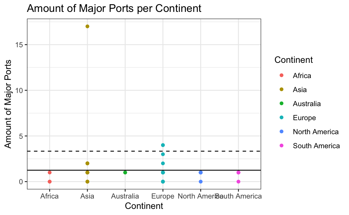
Above, we can see that there are points which most definitely lie outside of the mean and standard deviation lines. This is a strong indication that these are potential outliers and possibly incorrect information. To further check this, a boxplot can be made.
# Box plot for the amount of major ports
ggplot(globalCitiesData, aes(x=Continent, y=Major.Ports, group = Continent, fill=Continent)) +
  geom_boxplot(colour="black") +
  labs(title = "Outlier Plots of Major Ports",
       x = "Continent",
       y = "Amount of Major Ports") +
  theme_bw()
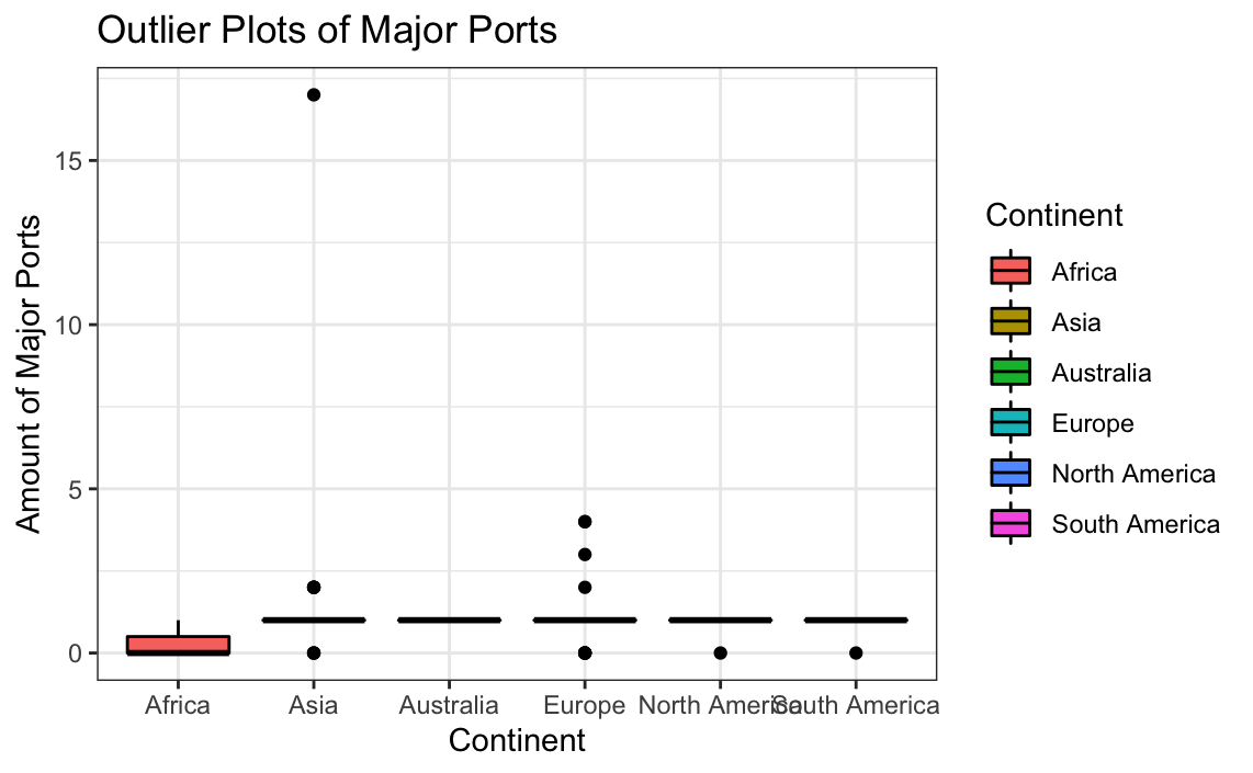
It can be seen that several outliers potentially exist; however, the large outlier located in Asia heavily skews the data. While many of the outliers can be explained by the existence of large portside cities, the largest outlier is difficult to come up with reasoning for. Removing potential outliers may lead to improved plots.
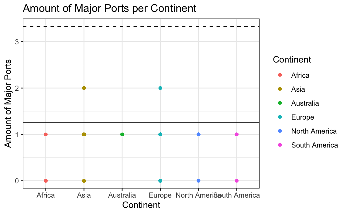
# Replotting the data without the outliers
ggplot(data = globalCitiesData[-which(globalCitiesData$Major.Ports>2.5),],
       mapping = aes(x = Continent, y = Major.Ports)) +
  geom_point(aes(colour = Continent)) + xlab("Continent") +
  ylab("Amount of Major Ports") + ggtitle("Amount of Major Ports per Continent")+
  geom_hline(aes(yintercept = mean(globalCitiesData$Major.Ports))) +
  geom_hline(aes(yintercept = (mean(globalCitiesData$Major.Ports) +
  sd(globalCitiesData$Major.Ports))),linetype="dashed") +
  theme_bw()
# New outlier plot
ggplot(globalCitiesData[-which(globalCitiesData$Major.Ports>2.5),],aes(x=Continent,y=Major.Ports, group = Continent, fill=Continent)) +
     geom_boxplot() +
    labs(title = "Outlier Plots of Major Ports",
          x = "Continent",
          y = "Amount of Major Ports") +
  theme_bw()
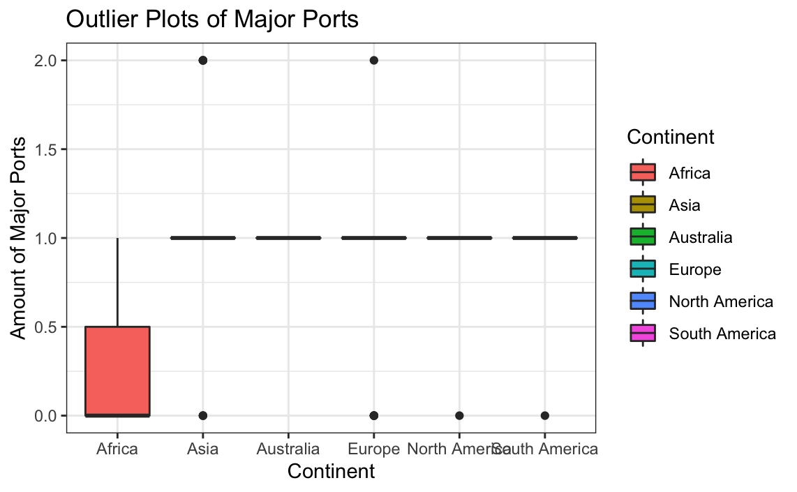
The above boxplot looks incredibly strange; however, visual analysis of the table shows that most cities actually only have 0, 1, or 2 ports. This means that the vast majority will then have a mean of 1 with very few outside this amount at 0 or 2. The scatter plot shows that all the data now lies within the deviation range. Therefore, despite the strange outlier plot, the results make more sense than the results that contained the outliers.
Higher Education Institutions
Below, tables for the higher education institutions per continent are created to determine the existence of possible outliers.
# PLotting higher education institutions
ggplot(data = globalCitiesData,
       mapping = aes(x = Continent, y = Higher.Education.Institutions)) +
  geom_point(aes(colour = Continent)) +
  xlab("Continent") +
  ylab("Amount of Higher Education Institutions") +
  ggtitle("Amount of Higher Education Institutions per Continent")+
  geom_hline(aes(yintercept = mean(Higher.Education.Institutions)))+
  geom_hline(aes(yintercept = (mean(Higher.Education.Institutions)+
  sd(Higher.Education.Institutions))),linetype="dashed") +
  theme_bw()
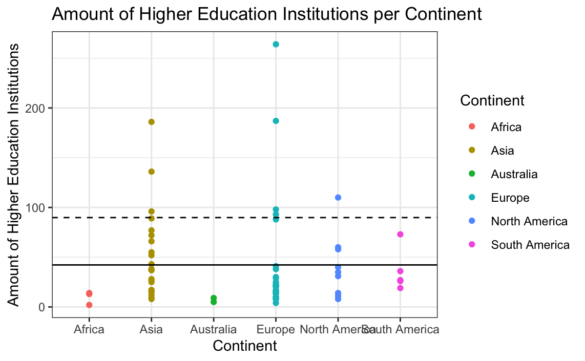
To further check for outliers, a boxplot can be made.
# Plotting outliers for higher education institutions
ggplot(globalCitiesData, aes(x=Continent, y=Higher.Education.Institutions, group = Continent, fill=Continent)) +
     geom_boxplot(colour="black") +
    labs(title = "Outlier Plots of Higher Education Institutions",
          x = "Continent",
          y = "Amount of Higher Education Institutions") +
  theme_bw()
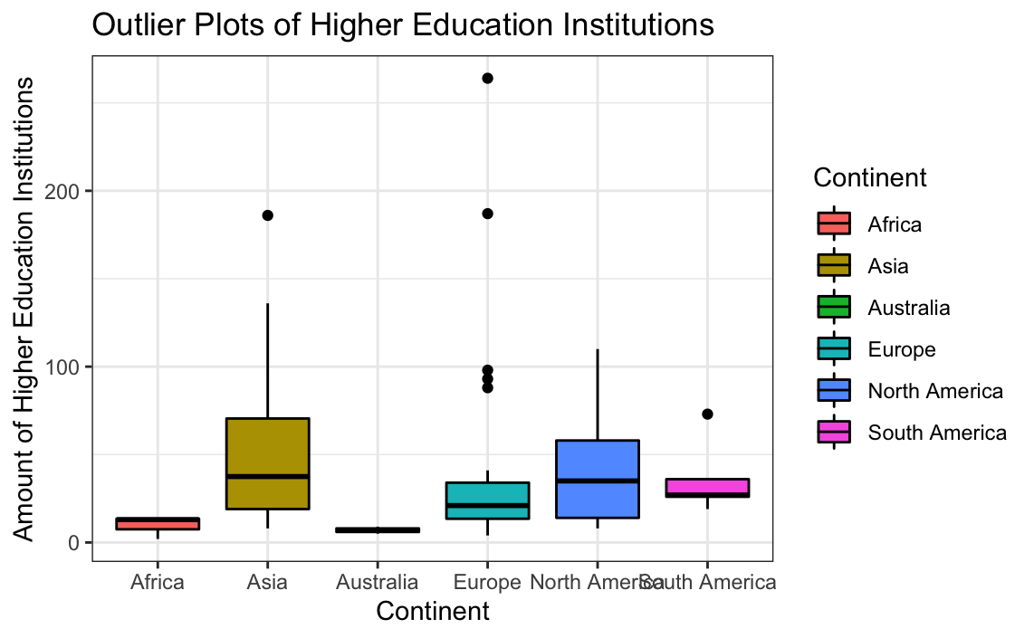
Again, there appear to be large values skewing the distribution; removing them following the standard deviation line may lead to better plots.
# Box plot for higher education institutions without the large outliers
ggplot(globalCitiesData[-which(globalCitiesData$Higher.Education.Institutions>90),],aes(x=Continent,y=Higher.Education.Institutions, group = Continent, fill=Continent)) +
     geom_boxplot() +
    labs(title = "Outlier Plots of Higher Education Institutions",
          x = "Continent",
          y = "Amount of Higher Education Institutions") +
  theme_bw()
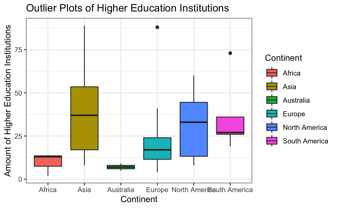
Removing large values skewing the distribution improved the graphs’ quality, but we cannot be sure if removing them is actually a good idea. The outliers may be plausibly explained if we had an expert who understood this data better.
Bivariate Analysis
Next, the data will be further inspected.
Most variables were tested against each other wherever possible. However, not every plot or test is included in order to save space. Only examples which are suitable for process demonstration or which are of vital interest are included.
Life Expectancy and Infant Mortality
The below data analyzes the relationship between general life expectancy and infant mortality.
# Plotting infant mortality rate versus life expectancy
ggplot(data = globalCitiesData, mapping = aes(x = Life.Expectancy,
                                              y = Infant.Mortality..Deaths.per.1.000.Births.)) +
  geom_point(aes(colour = Continent)) +
  xlab("Life Expectancy") +
  ylab("Infant Mortality per 1000 Births") +
  ggtitle("Infant Mortality versus Life Expectancy") +
  theme_bw()
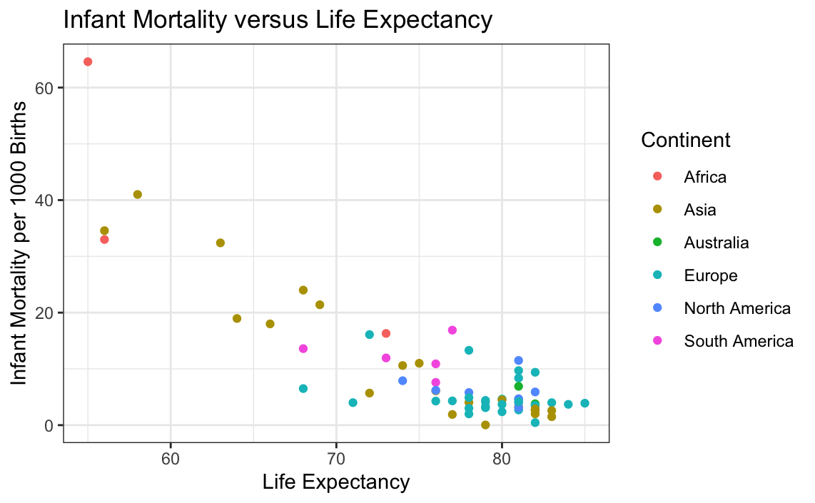
It can be seen above that as life expectancy for a city increases, the infant mortality decreases. Additionally, the continents that a city is located in seem to be correlated with this. This makes sense because richer continents such as Europe, North America, and some countries within Asia would have a population with better access to better healthcare. To check this, another plot must be made.
# Plotting outliers for life expectancy and infant mortality
ggplot(globalCitiesData, aes(x=Life.Expectancy,
                             y=Infant.Mortality..Deaths.per.1.000.Births.,
                             group = Continent, fill=Continent)) +
  geom_boxplot(colour="black") +
  labs(title = "Outlier Plots of Life Expectancy versus Infant Mortality",
       x = "Life Expectancy",
       y = "Infant Mortality Rate") +
  theme_bw()
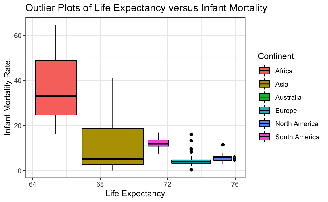
While the plots are mostly good, it can be seen that the data for Europe has many values that skew the plot. This can be further examined, as seen below.
# Plotting only data from Europe
ggplot(globalCitiesData[-which(globalCitiesData$Continent!="Europe"),], aes(x=Life.Expectancy, y=Infant.Mortality..Deaths.per.1.000.Births.)) +
     geom_boxplot(colour="black",fill="cornflowerblue") +
    labs(title = "Outlier Plots of Life Expectancy versus Infant Mortality",
          x = "Life Expectancy",
          y = "Infant Mortality Rate") +
  theme_bw()
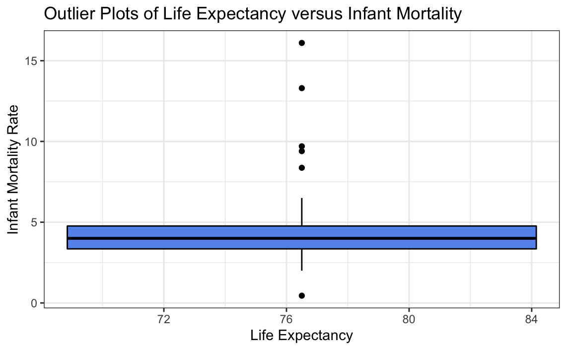
Isolating the data to Europe, which had the most outliers, it can be seen that the data may be plausibly explained by the countries within Europe having different contexts rather than the data itself. Therefore, no further transformation should be done from here.
GDP and Life expectancy
The following data checks for a relationship between the GDP per capita in a city versus the Life Expectancy within the city.
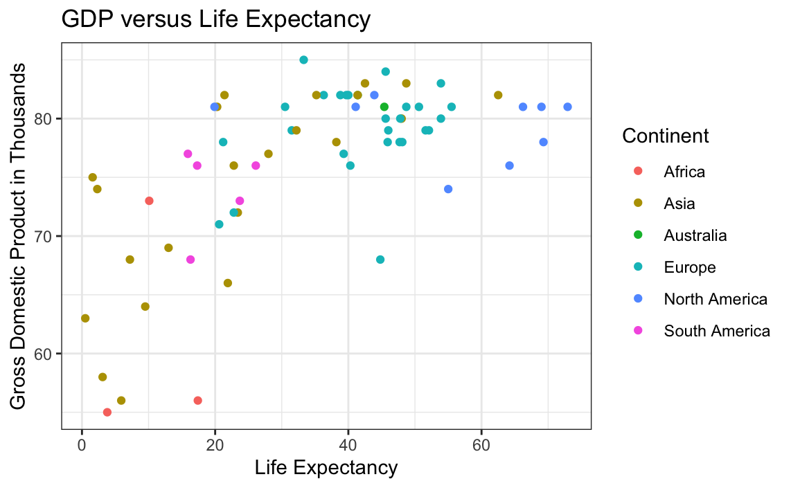
ggplot(data = globalCitiesData, mapping = aes(x = GDP.Per.Capita..thousands....PPP.rates..per.resident.,
                                              y =Life.Expectancy)) +
  geom_point(aes(colour = Continent)) +
  xlab("Life Expectancy") +
  ylab("Gross Domestic Product in Thousands") +
  ggtitle("GDP versus Life Expectancy") +
  theme_bw()
ggplot(globalCitiesData, aes(x=Life.Expectancy, y=GDP.Per.Capita..thousands....PPP.rates..per.resident., group = Continent,  fill=Continent)) +
     geom_boxplot() +
    labs(title = "Life Expectancy versus GDP of cities in each continent",
          x = "Life Expectancy",
          y = "GDP in Thousands") +
  theme_bw()
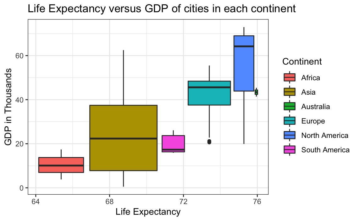
It can be seen that small outliers do exist in Europe. From visual inspection of the data, it can be seen that Ankara in Turkey has a much smaller GDP than the rest of the cities. This appears to be reasonable. But not enough background information is known/provided to verify this, and so outliers for this relationship cannot be determined to be errors. Overall, the data does not have many outliers, and those it does have can be reasonably explained. Therefore it can be determined that the dataset has reasonable numbers on life expectancy and GDP.
Unemployment Rate and Poverty Rate
The next relationship to be analyzed is between unemployment and poverty. Below a plot can be seen displaying this relationship (if it exists).
# Plotting Poverty Rate versus Unemployment Rate
ggplot(data = globalCitiesData, mapping = aes(x = Unemployment.Rate, y = Poverty.Rate)) +
  geom_point(aes(colour = Continent)) +
  xlab("Poverty Rate") +
  ylab("Unemployment Rate") +
  ggtitle("Unemployment versus Poverty Rates") +
  theme_bw()
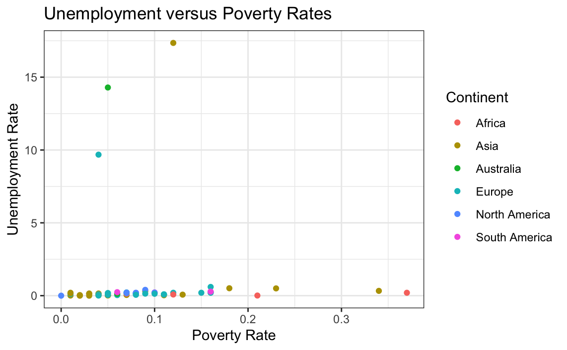
The resulting plot is unclear and appears to have large values skewing the distribution. Therefore univariate analysis of the individual variables may provide further information.
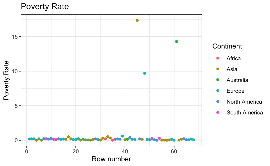
# Plotting only poverty rate against the row number
ggplot(globalCitiesData, aes(x = as.numeric(row.names(globalCitiesData)),
                             y=Poverty.Rate)) +
  geom_point(aes(colour = Continent)) +
  xlab("Row number") + ylab("Poverty Rate") +
  ggtitle("Poverty Rate") +
  theme_bw()
# Plotting unemployment rate exclusively against row number
ggplot(globalCitiesData, aes(x = as.numeric(row.names(globalCitiesData)),
                             y=Unemployment.Rate)) +
  geom_point(aes(colour = Continent)) + xlab("Row number") +
  ylab("Umeployment Rate") +
  ggtitle("Unemployment Rate") +
  theme_bw()
The results are strange, and so boxplots are made for each variable to check for outliers.
# Plotting unemployment rate per continent
ggplot(globalCitiesData, aes(x = Continent, y=Unemployment.Rate, group = Continent,  fill=Continent)) +
     geom_boxplot() +
    labs(title = "Unemployment Rate in each continent",
          x = "Continent",
          y = "Unemployment Rate") +
  theme_bw()
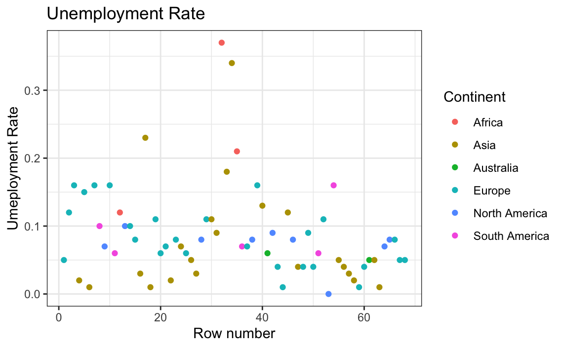
The unemployment rate has some issues; one entry even has 0 as a value. This must be an error considering all areas have an unemployment rate greater than 0 (Zagorsky, 2018). Now to check the poverty rate per continent.
# Plotting poverty rate per continent
ggplot(globalCitiesData, aes(x=Continent, y=Poverty.Rate, group = Continent,
                             fill=Continent)) +
  geom_boxplot() +
  labs(title = "Poverty Rate in each continent",
       x = "Continent",
       y = "Poverty Rate") +
  theme_bw()
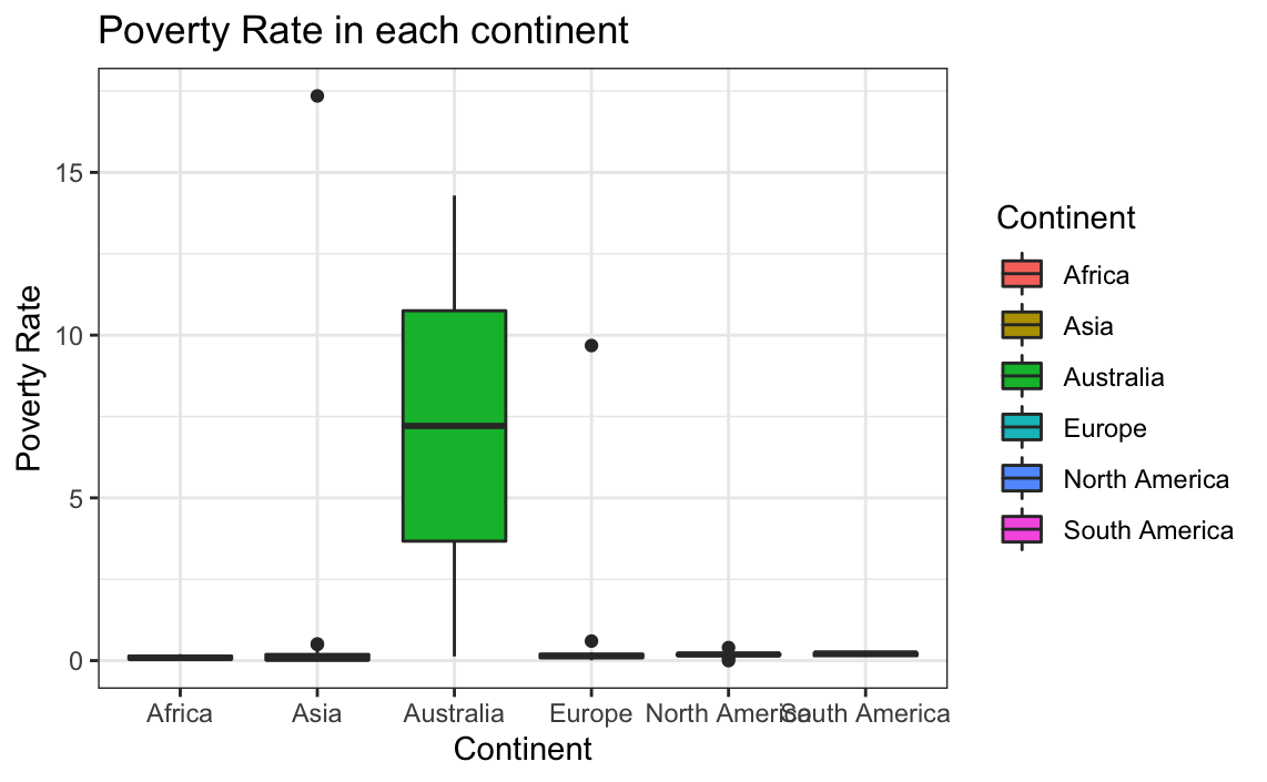
It is obvious that the issues that came with finding the distributions between the unemployment rate and poverty rate mostly came from problems with the poverty rate. Both appear to be missing data, with poverty missing a substantial amount. Visual inspection of the data shows that several cities are listed as having a poverty rate of 0, which is not currently valid anywhere on Earth (Zagorsky, 2018). It is important to note that the fact that this is an outlier was only identified because of the background knowledge we already had on the subject. If this was not known, transformation should not be done since they could not be done in confidence.
What should we do about the Outliers
As previously stated, there are issues with the dataset. Below, outliers and missing values are dealt with to ensure optimal data for analysis.
# Summarizing all data which has a poverty rate of 0
# This is too long to print
summary(filter(globalCitiesData, globalCitiesData$Poverty.Rate!='0'))
We can see above that the 0 values do not appear to have any sort of pattern. Before continuing, it is important to note that these 0 values are only being treated as missing since it is known that poverty rates of 0 do not exist. If this were not the case, this data should not be changed or touched.
Outliers
However, since our knowledge of the number of ports and higher education institutions per city is extremely limited, this data will be left in because it cannot be said for sure if they are errors.
Missing Values
We are interested in understanding the relationship between poverty and unemployment rates and how this relationship may change based on the country or continent. To answer these questions, it is important to have the best possible cleaned data so the missing data must be dealt with.
The largest issue with this dataset comes in the form of missing values. This can mean several things. Most likely, the number 0 was used to represent no data. It is also possible that this was due to input error. Either way, the 0 values skew the results.
The first step to dealing with this is to examine the issue further.
Since each row contains unique data on unique cities, it is not optimal to remove rows with missing values. Additionally, the data does not appear to be linearly correlated with other data points. Therefore, the KNN nearest neighbor method will be used.
# Performing a knn Imputation on the poverty rate data
globalCitiesData$Poverty.Rate[globalCitiesData$Poverty.Rate=="0"] <- NA # (mbq, 2011)
globalCitiesData <- knnImputation(globalCitiesData,k=10)
To double check:
# Checking results through the summary statistics
summarize(globalCitiesData,
          max_PR=max(globalCitiesData$Poverty.Rate),
          min_hied=min(globalCitiesData$Poverty.Rate))
##   max_PR min_hied
## 1   0.37        0
It can be seen that the minimum value is now 0.01, the missing values have been fixed
Similar to the poverty rate, the unemployment rate has a single missing value. This can be resolved in the same way.
# Checking the summary statistics for unemployment rate
summarize(globalCitiesData, max_PR=max(globalCitiesData$Unemployment.Rate), min_hied=min(globalCitiesData$Unemployment.Rate)) #(mbq, 2011)
##   max_PR min_hied
## 1   0.37     0.01
It can be seen that the minimum value is now 0.01, the missing values have been fixed.
Part Two: Interactive Visualizations
The first step involves reading in the data, and bringing in the libraries which will be used as well.
# Reading in global cities data
globalCitiesData <- read.csv("GlobalCitiesPBI.csv")

# Bringing in neccessary libraries
library(knitr)
library(ggplot2)
library(stringr)
library(DMwR)
library(plotly)
The visualizations below show multivariate plots of the global cities dataset. Life expectancy versus GDP is shown using a scatterplot because both axes’ data comes in a continuous form that is not connected by time. Furthermore, the values have been organized by color using the continent of origin of each city. This helps provide further context to the plot and elaborates on the the nature of the data and why some points may be higher or lower than others. It can also show potential connections of the relationship between life expectancy and GDP to their geographical region. Different locations have different socioeconomic factors, and these can help further explain the relationship between the two primary variables shown.
# Plotting GDP and life expectancy using ggplot2
ggplot(data = globalCitiesData,
       mapping = aes(x = GDP.Per.Capita..thousands....PPP.rates..per.resident., y =Life.Expectancy))+
  geom_point(aes(colour = Continent)) +
  xlab("GDP per Capita in Thousands") +
  ylab("Life Expectancy")+
  ggtitle("Life Expectancy versus GDP") +
  theme_bw()
The plot of life expectancy versus the unemployment rate is built in the same way as the one above, which uses GDP. A scatter plot is optimal to display the potential relationship. Since the points can take on any value in a certain range, visualizations of the categorical kinds such as bar plots would not convey the information in the same effective manner.
# Plotting unemployment rate and life expectancy
ggplot(globalCitiesData, mapping = aes(x = Life.Expectancy)) +
  geom_point(aes(y=Unemployment.Rate,colour=Continent))+
  xlab("Life Expectancy") + ylab("Unemployment Rate")+
  ggtitle("Life Expectancy versus Unemployment Rate") +
  theme_bw()
When visualizing a categorical and a continuous variable, bar plots can reveal a lot of information. The below plot gives the city population sizes for all the cities and has ordered them from largest to smallest. Finally, the legend also displays the Continent of each city once again. This visualization allows one to see which regions have the most populous cities and the sizes of each city exactly. A scatter plot in this scenario would show very similar data, but would not as effectively communicate the size differences in population per city due to the fact that this would be showed simply with the height of the point rather than with the dimensions of a bar of data as shown below.
ggplot(globalCitiesData,
      aes(x=reorder(Geography,-City.Population..millions.),
          y=City.Population..millions.)) +
  geom_bar(stat="identity", aes(fill=Continent),
           colour="black", width=0.9)+
  theme(axis.text.x  = element_text(size=6.9)) +
  xlab("City Population Size") +
  ylab("City Population Size")+
  ggtitle("City Population Sizes in Each Country")+
  theme(axis.text.x = element_text(angle = 90, hjust = 1)) + theme_bw()

# (Chang, 2009), (zero323, 2015)
This next plot shows the city areas and population sizes per continent. This information is useful to split up because different regions tend to have distinct architectures and styles of living and differing amounts of physical space to expand in. This means that splitting the data per continent can help show the information in a context where it is easier to compare each city to those in geographically similar situations.
# Plotting city areas and city population sizes split by continent
ggplot(globalCitiesData, aes(x = City.Area..km2., y =City.Population..millions.,
                             group=Continent)) + geom_point(aes(colour = Continent)) +
                             xlab("City Area in Kilometers Squared") +
                             ylab("City Population in Millions") +
                             ggtitle("City Areas versus City Population Sizes Accross                                                                     Continents") +
                            theme_bw()+facet_grid(~Continent) +
                            theme(axis.text.x = element_text(angle = 90, hjust = 1))

# (Chang,2009)
The following plot shows the air quality within a city versus the GDP per Capita per person. This data was displayed in the form of a bubble plot since each city has values for air quality and gdp which both can take on any variable rather than being of a categorical nature. Furthermore, the size of each point changes based on the size of the population in each city. This helps provide further information and context to each value. The data for air quality was transformed in order to clarify the message of the graph further. The air quality index works by listing air quality on a scale of 0 to 500, with 0 being good and 500 being hazardous (US EPA, 2017). The problem with this is that using these values, one who is not familiar with the air quality index could believe that an extremely polluted city like Dehli for example, has good air quality since it is listed as 200 rather than understanding that this value is a bad sign. Therefore, a new column sorting the air quality is created to reduce confusion.
The plot is interactable, hover over points for more information and double click on elements in the legend to isolate and examine them.
p <- plot_ly(globalCitiesData, x = ~GDP.Per.Capita..thousands....PPP.rates..per.resident., y = ~Air.Quality.,
             type = 'scatter', mode = 'markers',
             hoverinfo = 'text',
             color = ~Continent,
             marker = list(size = ~City.Population..millions., sizeref = 0.6, showlegend=F),
             text = ~paste('</br> City: ', Geography,
                      '</br> Country: ', Country,
                      '</br> Average Life Expectancy in Years: ',  Life.Expectancy)) %>%
  layout(title = "Air Quality versus GDP per Capita in Global Cities",
         xaxis = list(title = 'GDP per Capita'),
         yaxis = list(title = 'Air Quality Index')) %>%
  layout(yaxis = list(
    ticktext = list("Good", "Moderate", "Potentially Unhealthy", "Unhealthy", "Very Unhealthy"),
    tickvals = list(50, 100, 150, 200, 300),
    tickmode = "array"))
p
The below plot shows the infant mortality rate in each city versus life expectancy. For similar reasons as the above plot, the following plot uses a bubble plot form to show the relationship between two variables which are not categorical. This allows for the relationship between each axis to naturally be revealed by the position of the points. Furthermore, the size of the points now corresponds to the GDP of each city displayed while the colours still display the continent. This allows for further information to be communicated through the plot without adding another axis or more points. The plot is again interactive. Hover over points for further information. Additionally, if you wish to isolate certain elements in the legend, simply double click on them.
# Plotting life expectancy and infant mortality rate with bubble size as gdp and colour as #continent
p <- plot_ly(globalCitiesData, x = ~ Life.Expectancy,
             y = ~Infant.Mortality..Deaths.per.1.000.Births., type = 'scatter', mode = 'markers',
             hoverinfo = 'text',
             marker = list(size = ~GDP.Per.Capita..thousands....PPP.rates..per.resident.,
                           sizeref = 3, showlegend = T),
             color = ~Continent,
             text = ~paste('</br> City: ', Geography,
                      '</br> Gross Domestic Product in Thousands: ',
                      GDP.Per.Capita..thousands....PPP.rates..per.resident.,
                      '</br> Life Expectancy in Years: ',  Life.Expectancy,
                      '</br> Infant Mortality per 1000 Births: ',
                      Infant.Mortality..Deaths.per.1.000.Births.)) %>%
  layout(title = "Infant Mortality versus Life Expectency in Global Cities",
         xaxis = list(title = 'Average Life Expectancy in Years'),
         yaxis = list(title = 'Infant Mortality per 1000 Births'))
p
The below plot shows a way to combine scatter and line plots to easily convey more information. The plot gives the life expectancies for males and females for each city in the form of points and then also shows the average life expectancy per city as well. This average is graphed in the form of a line. This allows one to see whether points fall above or below the average with ease and therefore exemplifies the relationship found between life expectancy and gender.
# Plotting life expectancy of males versus females as well as the average per city
p<-ggplot(globalCitiesData) +
  geom_line(aes(x=Life.Expectancy,y=Life.Expectancy))+
  geom_point(aes(x=Life.Expectancy,y = Life.Expectancy.in.Years..Male.,colour="Male"))+
  geom_point(aes(x=Life.Expectancy,y = Life.Expectancy.in.Years..Female.,colour="Female")) +
  theme(axis.text.y  = element_text(size=6.8)) +
  xlab("Life Expectancy of Males in Years") +
  ylab("Life Expectancy of Females in Years")+
  ggtitle("Life Expectancy of Females versus Males") +
  theme_bw()+scale_colour_manual("",
                      breaks = c("Male", "Female"),
                      values = c("darkorchid1", "cornflowerblue")) # (Chang, 2009), (Diggs, 2012)
p<-ggplotly(p)
p
References
Rodriguez, Dania M. “dataMeta: Making and Appending a Data Dictionary to an R Dataset”. cran.r.project.org, 11th August, 2017, https://cran.r-project.org/web/packages/dataMeta/vignettes/dataMeta_Vignette.html. Accessed October 15th, 2019.
Kabacoff, Robert I. “Descriptive Statistics”. Datacamp, 2017. https://www.statmethods.net/stats/descriptives.html. Accessed October 15th, 2019.
Chase. “R ggplot2: Labelling a horizontal line on the y axis with a numeric value” StackExchange, October 13th, 2012. https://stackoverflow.com/questions/12876501/r-ggplot2-labelling-a-horizontal-line-on-the-y-axis-with-a-numeric-value. Accessed October 16th, 2019.
Mbq. “Conditionally Remove Data Frame Rows with R”. StackExchange, November 4th, 2011. https://stackoverflow.com/questions/8005154/conditionally-remove-dataframe-rows-with-r. Accessed October 18th, 2019.
Zagorsky, Jay L. “Why the Unemployment Rate will Never get to 0 Percent- but It Still Could Go a Lot Lower”. TheConversation, September 21st, 201. https://theconversation.com/why-the-unemployment-rate-will-never-get-to-zero-percent-but-it-could-still-go-a-lot-lower-103665. Accessed October 18th, 2019.
Ha, Amanda. “Total employment decreased over the month, but increased by 37,600 over the year”. Employment Developement Department, October 18th, 2019. https://www.labormarketinfo.edd.ca.gov/file/lfmonth/sanf$pds.pdf. Accessed October 18th, 2019.
Globalization and World Cities Research Network (GaWC). Loughborough University, 2019. https://www.lboro.ac.uk/gawc/group.html. Accessed October 15, 2019.
“R Figure Reference” Plotly, 2019. https://plot.ly/r/reference/. Accessed October 25th, 2019.
Chang, Jonathon. “Rotating and Spacing Axis Labels in ggplot2”. Stackexchange, August 25th, 2009. https://stackoverflow.com/questions/1330989/rotating-and-spacing-axis-labels-in-ggplot2. Accessed October 24th, 2019.
Diggs, Brian. “Add Legend to ggplot2 Line Plot”. Stackexchange, April 27th, 2012. https://stackoverflow.com/questions/10349206/add-legend-to-ggplot2-line-plot. Accessed October 24th, 2019.
United States Environmental Protection Agency. “Air Quality Index”. airnow.gov, July 27th, 2017. https://airnow.gov/index.cfm?action=aqi_brochure.index. Accessed October 24th, 2019.
zero323. “geom_bar Define Border Color with Different Fill Colors”. Stackexchange, June 8th, 2015. https://stackoverflow.com/questions/30709972/geom-bar-define-border-color-with-different-fill-colors. Accessed October 24th, 2019.